Which artworks make an impact or impression on me? Why?

Roy Lichtenstein's "Explosions from the Portfolio 9", Print, 1967
- This print made an impression on me with the use of colored dots to fill in space instead of solid colors. I have a few art prints that have a similar style so this really appealed to my eye.

James Rosenquist's "Nomad", Oil on canvas, 1963
-This painting made an impression on me because I love to travel. The term nomad means not stayingin onve place for very long and moving from place to place. I feel this painting expresses this idea by showing a variety of different objects from different places.

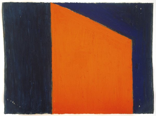
Mark Rothko's "Orange and Yellow", Oil on Canvas, 1956
-This painting caught my eye with the color selection. My favorite color is orange so this appealed to my eye. I feel that orange is a very warm and glowing color.
Which artworks do I feel a connection with? Why?
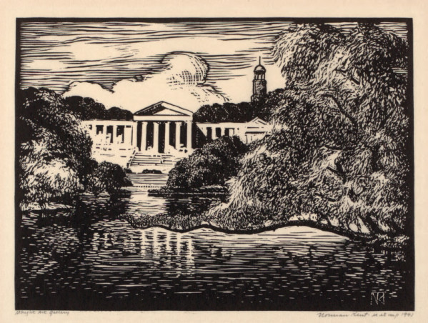
Norman Kent's "Albright Art Gallery", Print, 1941
-I felt a connection with this print because I know what it is and I have seen it in person. I feel that it is a lot easier to connect with art sometimes when you are already familiar with the subject.

William Home Lizars' "Bridge Across the Rapids at Niagara", Print, 1827
-I really felt a connection with this print, again, because I am familiar with the subject. When I first saw this print I was thinking what would this area look like to the artist today? Things have changed a great deal since this print was made.

David Plowden's "Erie Lackawana Railroad...", Photograph, 1947
-I am from Buffalo and when I first saw this my response was similar to above; what would this photo look like if it was taken today. Clearly taken when the steel plant and surrounding area was booming with thousands of workers and a great industry. Today you would find a train station not in use and empty, decaying buildings with their best times long gone.
Which artworks would I like to know more about? Why?

Donald Sultan's "December 6, 1978", Drawings and Watercolor, 1978
-I wanted to know more about this piece because it seems unfinished to me. Was this the artist's rendition of an unproductive day?

Sheila Isham's "Magic Mountain XV", Acrylic and Pastel on Paper, 1982
-I wanted to know more about this piece and specifically where it is assuming it is a real place. I think it is a very unique use of colors that I would not automatically associate with a mountain but maybe that is because it is not a real mountain?
Thorton Willis' "Sharon's Dream", Oilstick on Paper, 1980
-It would be very helpful to understand this piece with a little more information. I can not grasp how this could represent a dream, more information could help to change my reaction.
While I did not choose any of the same artwork, I agree with most of your assessments. I especially agree with your three paintings that you feel a connection with. In my art education classes, the teachers have been emphasizing the importance of showing children locally-created art. The students will have a deeper connection with this art, and it will therefore be easier to understand.
ReplyDeleteRothko is an artist that I've never been able to appreciate as much as I perhaps should. Having learned about him a little more this year, I am a little more open to his paintings, but I can't say that they have made much of an impression on me. I'm fine with very abstract art, but I find them almost painful to look at, especially this one. It's so glaring! Though maybe that is proof that it is indeed making an impression on me.
Magic Mountain XV feels much more like a dream than Sharon's Dream, so I, too, am curious as to what makes that painting dream-like. You don't tend to think of solid, geometrical shapes as dream-like (one of the reasons why Dali's clocks are warped and melting?), but then again a dream is a very personal thing, so perhaps it is supposed to be impenetrable.